Analyze This: 2020 ties with 2016 for hottest year on record
The most recent six years were the warmest ever recorded
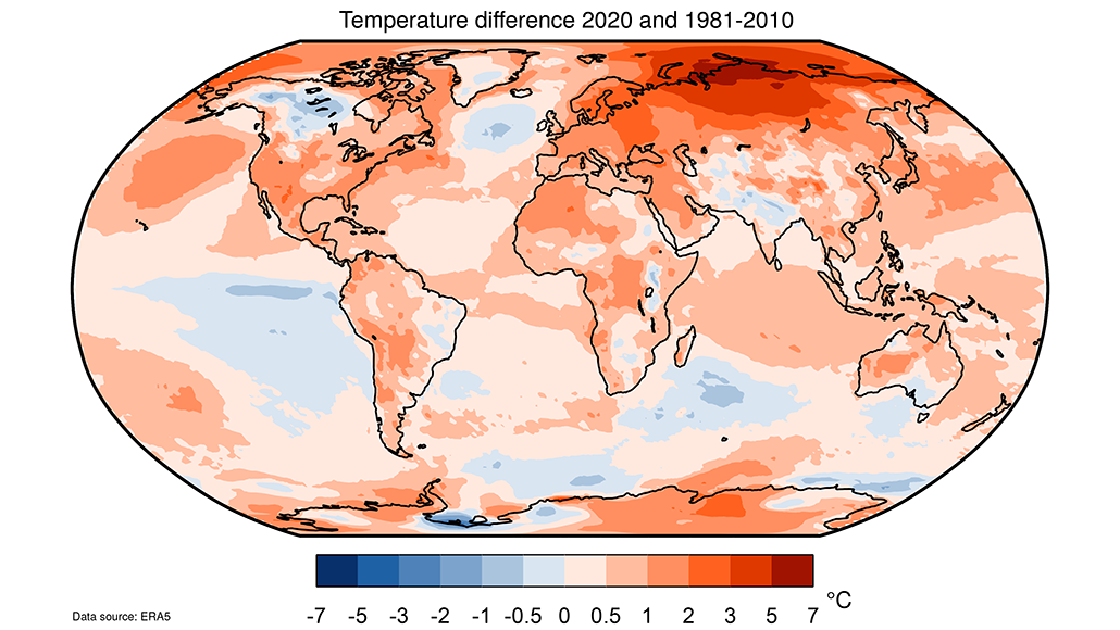
A new dataset that looks at the Earth’s average temperatures showed that 2020 tied the record for the warmest year ever recorded. Cooler areas are depicted in blue; warmer areas are redder.
Copernicus Climate Change Service/ECMWF
The year 2020 capped off the warmest decade on record. And last year tied with 2016 for the hottest, according to new data.
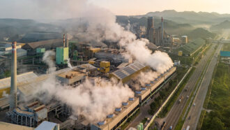
This record-warmth occurred even while 2020 saw decreased carbon-dioxide emissions from fossil-fuel use. “That’s not surprising at all,” says Freja Vamborg. She’s a climate scientist in Reading, England. Vamborg works at the Copernicus Climate Change Service (a program of the European Union). Some human activities that spew greenhouse gases dipped due to the COVID-19 pandemic, a new analysis shows. Travel was among them. But the global temperatures we’re seeing now are caused by greenhouse-gas emissions over many years — not just last year, Vamborg explains.
The Copernicus team looked at global temperatures back to 1950. “We can’t use a thermometer for the whole globe,” she says. Instead, researchers combine many measurements collected from places across the world.
These weather data aren’t spread out evenly across the world. And fewer of these observations exist for the earlier years. To fill in the gaps, the researchers meld many weather measurements, such as wind and humidity. Then they use computers to simulate real-world conditions. That lets them determine the average yearly temperature of the air near Earth’s surface.
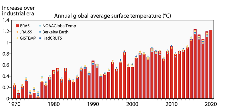
Comparing recent average temperatures to those in the past reveals how much Earth has warmed. The average global temp in 2020 was around 1.25 degrees Celsius (2.25 degrees Fahrenheit) higher than between 1850 and 1900, the team reports. In its analysis, that period stands in for the time before the industrial age, which began in the mid-1700s. An increase of 1.25 degrees may not seem like much. But scientists have recommended keeping warming to 1.5 degrees C (2.7 degrees F) since pre-industrial times. That would limit the increase in extreme weather and number of species extinctions expected as temperatures rise.
Global temperatures are expected to continue to increase in the coming years. That’s in part because emissions of greenhouse gases continue to go up every year. But it’s also because those gases linger in the atmosphere, for decades or even hundreds of years. The greenhouse gases released now won’t just have consequences in the coming year but also in decades to come, Vamborg says. So efforts to hold down warming will not only need to be big, she says, but maintained for a long time.

Data Dive:
Plot the following data from the Copernicus Climate Change Service:
| Decade | Increase in global temperature over pre-industrial times (degrees C) |
| 1951-1960 | 0.178 |
| 1961-1970 | 0.209 |
| 1971-1980 | 0.231 |
| 1981-1990 | 0.478 |
| 1991-2000 | 0.581 |
| 2001-2010 | 0.831 |
| 2011-2020 | 1.056 |
- The data in this table shows how much higher the mean temperature in each decade is over pre-industrial times. How do these temperatures change over time?
- When does the first large bump occur?
- Which decade(s) shows the largest increase over the previous one(s)?
- Now look at the graph above and its red bars. How do the first 10 years plotted compare with the last 10?
- In what year does the lowest value occur? In what year does the highest value occur?
- What is the trend in the values on the graph?
- Based on the trend in the graph, make a prediction for the future. Do you think the temperature increase over pre-industrial times in the years 2021 to 2025 will be higher, lower or about the same as in 2015 to 2020? How might that prediction change if global greenhouse gas emissions were to fall?